Tuesday, January 18, 2011
Sunday, January 9, 2011
Competitor Website
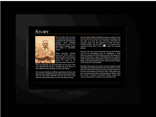
Buccellati(HomePage)

(Story)
Overall i quite like it, it is quite interesting and interactive. It use the main colour black to bring out the feeling of high class and secret which is i think is very suitable for jewellery. All the information are in the book there, you can search the topic you want at content page. The flow are very nice and easy understand. For my own opion can add some of the Icon inside.
Kezani(HomePage)

Overall this website is using black colour too as the main colour. The typeface it choose are not so suitable, and it is left a lot of space , interface design still can improve.
Beautiful Commercial Website

This is Korea website which using the idea of book, all the information are inside the book and the colour it use are strong enough for the topic very match. Typography arrangement are comfortable to read it on, although i not understand korea ... and it design some of icon which is cute and nice la. Navigation clear.
This website design look like very cool, it is suitable for the topic/product. The picture composition are very good. It used 2 colour for this website and it is very consident . The model are handsome too.


This website it play around the arrangement which is from left to right, it look more interesting, and very tidy, play around with the space.
This website have a good typography arrangement and it play around with the space quite nice, the compostion of the navigation is very nice. The model are pretty too.
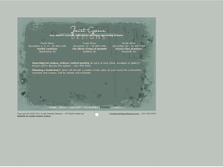
Client Website- Tomei

Public Event- Is lack of color , should add some color on it to get the jewellery feeling and the way to arrange those information are not nice and bored. NO HIERARCHY. The typeface it choose are not so suitable, can be improve.

Job Opportunities- The text are too many , look like very bored and lazy to read it out, should have some of the hierarchy or the way to arrange it. Maybe can add some colour to it to look more interesting.

Contact Page- The typography arrangement are not nice, should have some of hierarchy or
focus point to look like more interesting and not bored. The text are smaller.
Subscribe to:
Comments (Atom)


